|
|
Post by hollyelise89 on Jan 25, 2008 16:04:34 GMT 1
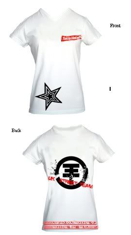
I really like the V-neck one nash and I agree with Claire... I don't think it needs a photo. If we had that one then maybe we could have 'UK Street Team'? on the back.
The second ones good with the logo, but don't like it so much...I think it reminds me of those non-smoking symbols...like we're against TH, if you just glance at it quickly. Maybe its just me?
But I do love the red and white on black t-shirt...that's great! and definately V-neck! Love it!
|
|
|
|
Post by xxxnashxxx on Jan 25, 2008 16:12:18 GMT 1
They are the same T-shirt, one is the front the second is the back
|
|
|
|
Post by princess666anne on Jan 25, 2008 17:29:44 GMT 1
I will probabaly sound like a twat, but, would it not be nice to make a design that would look pretty on a white t-shirt as well as black? Like the Bill hoodies, because then everyone is happy  I will try and throw together a design or two, but not today as I'm a tad busy  |
|
|
|
Post by xxxnashxxx on Jan 25, 2008 18:05:16 GMT 1
We can easily do that when we have our final design, by just reversing a few colours e.g  |
|
|
|
Post by princess666anne on Jan 25, 2008 18:07:28 GMT 1
Yay  Your design looks brilliant on black and white  It's a really good design  |
|
|
|
Post by Nikki on Jan 25, 2008 18:25:53 GMT 1
lol i really like it nash, ill do my designs later ! MY MUM DELETED PHOTOSHOP AHHHH ! im going to kill her ! i do all my work on there !!!!!! but.... ive just snuck into my schools IT system, and im gonna use the textiles progarmme on there without them knowing  all from the comfort of my own living room wow im clever. lol xxx |
|
|
|
Post by kiri on Jan 25, 2008 21:35:00 GMT 1
oohhh!nice design nicole!
nash i really like your t-shirt! maybe on the back you could have the logo a little smaller and slightly higher up
|
|
|
|
Post by hollyelise89 on Jan 25, 2008 21:44:47 GMT 1
Nikki...you're so devious!
I really like nash's designs...they kindo of say it all really don't they?
|
|
|
|
Post by xxxnashxxx on Jan 25, 2008 22:08:42 GMT 1
well its just a rough design for now, when we find the site were using, they will have the exact T-shirts on it. Then we can reposition everything so that it fits on it perfectly and looks great. Becuase the first T-shirt (Black) has a completally and nicer shape than the one I used for the White one. So it all depends on that.
|
|
|
|
Post by Nikki on Jan 25, 2008 23:01:27 GMT 1
lool, yeah. i cant be bothered to design one. ande nash's is really good so i dont see any point lol, id be happy wearing that !  i think whatever desgin we choose its VITAL that we have the websites on it. so yeah, lol. |
|
|
|
Post by xxxnashxxx on Jan 25, 2008 23:59:49 GMT 1
dont give up Nikki you may end up making something really great
|
|
|
|
Post by Nikki on Jan 26, 2008 0:05:47 GMT 1
lool, i cant be bothered ! and like i already said i like your design  im too tired, and im meant to be doing coursework atm anyway  |
|
|
|
Post by midori on Jan 26, 2008 14:43:58 GMT 1
I agree. I really like Nash' design. The idea with the star on the front is really cute and I think we don't necessariyl need a band pic on our shirts!
|
|
|
|
Post by THkidd on Jan 26, 2008 15:51:54 GMT 1
wow nash!! i love your design!! lol haha everyone does!! you could go far... XD!! the tees simple and cool, and OMG I LOVE THE STAR!! i will try and make some designs for tees, just once iv finished courseowork, and finding a work experiance placement for myself...  wish me luck... :S |
|
|
|
Post by Kiah[TH<3] on Jan 27, 2008 14:14:09 GMT 1
Oooh definitely love Nash's design! The star looks amaazing on black. =]
|
|